branching software
branching software
project mangaer, brand messaging, 3D imagery, build out of physical assets
Branching Software started as a locally owned software development company but had grown beyond their humble origins as a one-person enterprise. Branching had become a multifaceted platform for problem solving, not a sole proprietor service provider.
The line between a brand refresh and a true rebrand can sometimes be murky, and that was definitely the case with Branching. There were elements from the original identity that the founder wanted to keep, but otherwise the entire visual identity and brand tone was set for an update.
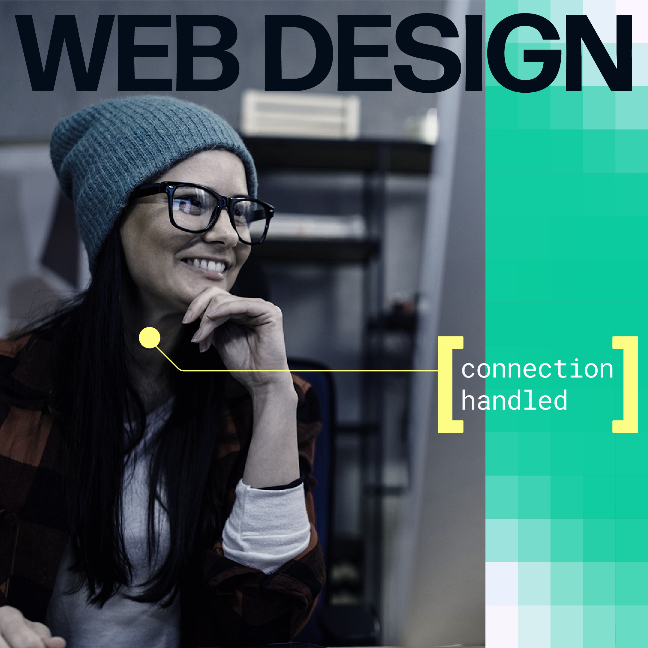
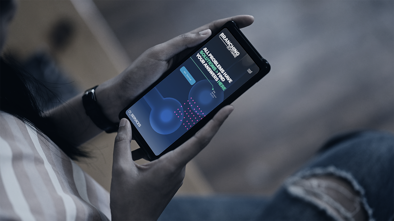
brand refresh, visual identity, web design
Branching Software started as a locally owned software development company but had grown beyond their humble origins as a one-person enterprise. Branching had become a multifaceted platform for problem solving, not a sole proprietor service provider.
The line between a brand refresh and a true rebrand can sometimes be murky, and that was definitely the case with Branching. There were elements from the original identity that the founder wanted to keep, but otherwise the entire visual identity and brand tone was set for an update.


.png)
.png)
Between the logo and the messaging, I refined the identity around the idea of connecting a problem to a solution and that this is done together, in teams, through collaboration.
For the remainder of the visual identity, I built out from the logo font and the original Branching colors to create a font system, color palette, and set of icons that all called back to the software development origins of the compnay, while allowing for bolder color combinations to signal action and problem solving.
Between the logo and the messaging, I refined the identity around the idea of connecting a problem to a solution and that this is done together, in teams, through collaboration.
For the remainder of the visual identity, I built out from the logo font and the original Branching colors to create a font system, color palette, and set of icons that all called back to the software development origins of the compnay, while allowing for bolder color combinations to signal action and problem solving.